eStore Manager
Manage Merchant Accounts
A “Merchant Account” is a type of bank account that allows individuals, businesses and organizations to accept and process payments by debit or credit cards.
Adding a Merchant Account
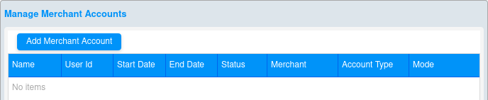
To setup and manage a merchant account (when not otherwise restricted by the Platform Administrator), click on the “eStore Manager” button and select the “Merchant Account” tab. When initially navigating to this page, it displays a blank table (see below).
To add a merchant account, click the “Add Merchant Account” button to bring up the “Add/Edit Merchant” screen (below).
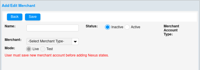
1) Enter the account name into the “Name” field. This field is alpha-numeric and is for your reference only; it is not system generated or pre-assigned.
2) Select the “Merchant” – also known as the Credit Card Processor or Gateway – from the drop-down menu. Keep in mind that the “Bypass” option is only used for test merchant accounts. No credit cards will be charged when utilizing this merchant selection. Depending on your Merchant selection, additional fields will be required (User Id and/or Key).
3) Select the account “Status” (Active or Inactive). Only one merchant account may be active at any given time. If more than one merchant account is setup, activating one account will automatically deactivate the other(s).
4) Click the “Save” button to save your changes or the “Back” button to exit the form without saving changes.
5) You will return to the “Manage Merchant Accounts” page. If the newly created account was saved, it will display on the table.
After creating a new merchant account, the unique account identifier(s) – “User Id” and/or “Key” – must be entered as necessary. Also, the state(s) where you or your company/organization reside – otherwise known as your “Nexus” state(s) – need to be setup for sales tax purposes. Follow the steps below to complete these portions of account setup.
6) Click on the merchant account “Name” hyperlink to access the account information on the “Add/Edit Merchant” screen.
7) Enter the “User Id” and/or “Key,” as determined by your Merchant Account Provider, into the designated fields. If either of these codes is not associated with your account, just enter dummy data here as these are both required fields.
8) Select the Nexus state(s) from the drop-down menu, and after each selection, click the “Save” button to add the state to the list.
9) For each state added to the list, select “Include” to include the State and Local (City and/or County) taxes, or select “Do not include” to only include State taxes.
10) Click “Delete” to remove a Nexus state from the list.
11) Click the “Save” button at the top of the screen to save your changes, or “Back” to exit the form without saving changes.
Customize Store
Assigned Templates
You may choose a template from those made available to you by the Platform Administrator. After selecting a template, you will be able to populate it with content through a variety of widgets at your disposal.
You need to be familiar with these concepts: Template, Container, Rows, and Widgets.
What is a template?
· A template is a pre-developed electronic page layout used as a basis from which to create new web pages with a similar design, pattern, or style.
· The current application contains multiple templates to choose from (Templates A, B and C).
What is a Container?
· A container is a part, or sub-set, of the template with a specified location.
· Each container has certain properties and size parameters associated with it.
· A template consists of a set of containers which make the template unique.
Examples:
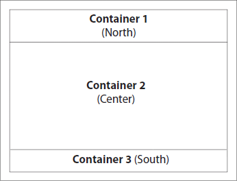
Template A
This template consists of 3 containers:
Container 1 (North): width = 980px, height = dynamic
Container 2 (Center): width = 980px, height = dynamic
Container 3 (South): width = 980px, height = dynamic
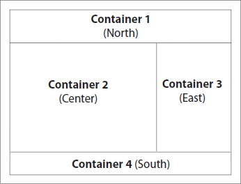
Template C
This template consists of 4 containers:
Container 1 (North): width = 980px, height = dynamic
Container 2 (Center): width = 720px, height = dynamic
Container 3 (East): width = 200px, height = dynamic
Container 4 (South): width = 980px, height = dynamic
What is a Row Cell?
· Row cells are the internal components of the containers.
· Each container will have a unique set of row cells.
· These row cells can be of varying pixel sizes.
Important characteristics of the row cells include:
· Each container consists of row cells.
· The default height of row cells is 200px (with the exception of within the “Custom Row” layout).
· The widgets (available to each respective container) can be dragged and dropped inside these row cells only.
· For each row cell combination, there are customization tools. These are displayed as tool tip icons which serve to “add row above,” “add row below,” “select row layout,” “delete row,” “move row up,” and “move row down.”
The row cells are available in a variety of pixel dimensions depending on the associated container and template.
If the height of a widget to be placed into a cell is greater than the default row height, the row cells will adjust the height dynamically to accommodate the tallest widget in the row.
Cell width is fixed according to pre-set properties and will not adjust dynamically as will cell height. Therefore, if a combination of widgets are placed into a cell, and their total width is greater than that of the cell into which they are placed, the far right widget placed into the referenced cell will automatically move down vertically so as not to distort the integrity of the template layout.
Depending on the container selection, the row cells will have certain editable parameters and row cell combinations. See examples noted below:
North and South Containers:


Row cell combinations:
200 200 200 280 – in every sequential combination
200 280 420 – in every sequential combination
280 640 – in both sequential combinations
200 200 500 – in every sequential combination
420 500 – in both sequential combinations
200 720 – in both sequential combinations
940
980
Custom Row Layout – row cell layout not pre-set; determined by the user
Center Container:


The center container has multiple layouts.
Template A
Row cell combinations:
200 200 200 280 – in every sequential combination
200 420 280 – in every sequential combination
640 280 – in both sequential combinations
200 200 500 – in every sequential combination
420 500 – in both sequential combinations
200 720 – in both sequential combinations
940
980
Custom Row Layout – row cell layout not pre-set; determined by the user
Templates B and C
Row cell combinations:
200 200 280 – in every sequential combination
280 420 – in both sequential combinations
500 200 – in both sequential combinations
720
Custom Row Layout – row cell layout not pre-set; determined by the user
Row cell options: 6 Options - “add row above,” “add row below,” “delete row,” “select row cell layout,” “move row up,” and “move row down.”
Row cell options: 6 Options - “add row above,” “add row below,” “delete row,” “select row cell layout,” “move row up,” and “move row down.”
West or East Containers:


Row cell combinations: 200px in stack layout only.
Row cell options: 5 options - “add row above,” “add row below,” “delete row,” “move row up,” and “move row down.”
What is a Widget?
A Widget is a reusable building block that is placed inside Containers to house the various types of content. An unlimited number of Widgets can be placed inside a Container. The Container layouts together with internal Widget properties determine the size and position of the Widgets. Examples of typical Widgets are: Navigation, Banner, Product, Advertising, Arbitrary HTML, Company Information, etc.
NOTE: For a complete description of the functionality and properties of all Widgets available for each respective Container, please see the Widgets section.
What is the procedure to place a Widget in a Container?
When you are on the Edit Template screen, all the Containers related to the template will be displayed as thumbnail images at the top of the screen
You may edit any of the Containers by clicking on its thumbnail image, and the screen will display all the available Widgets and the Row Cell options pertaining to that Container. Drag and drop the Widgets from the “Available Widgets” section on the right side of the screen into the various Container cells. This will place the Widgets into the Containers.
Note: After placing each Widget into a Row Cell, the editable Widget Properties will appear. You may update the Properties as desired.
Store Information
To view or edit your store information, click on the “eStore Manager” button. Select the “Customize Store” tab and then the “Store Information” sub-tab.
This page displays the below fields that can be edited:
● Name: Enter the full name for your eStore’s Customer Service Contact.
● Email: Enter the email address for your eStore’s Customer Service Contact. This will be visible to your customers in the footer of your eStore.
● Phone: Enter the phone number for your eStore’s Customer Service Contact. This, too, will display in the footer of your eStore.
● Banner URL: Please leave the default value in this field. The related banner hyperlink functionality is currently being updated.
● Store Name: This value functions as an alternate subdomain URL. This text can be substituted at the end of your eStore’s direct Platform URL. For example: www.PlatformName.com/demostore1. In this case, demostore1 is the subdomain. The value entered here may contain letters, numbers, or underscores only, no spaces.
When you are finished modifying the Store Information, click “Save Store Info” to keep the changes.
Image Manager
Click on the “eStore Manager” button. Select the “Customize Store” tab and then the “Image Manager” sub-tab.
The Image Manager allows access to multiple graphic files, by type, that are available for display on your eStore. Images and flash files already loaded to the select Reseller’s account will display here, and it provides a method for adding and/or deleting these files as well. This page has tabbed sections, representing sub-directories, for organizing your images. Upload multiple Banners to switch out easily. Upload Hosted Images to display on your Information Pages. Hosted Flash Files and Ads can also be loaded and referenced in your eStore Template content if permitted by the Platform Administrator. Allowable image file types are .jpg, .png, and .gif (including animated .gifs and transparent .gifs) and only .swf flash files are permitted.
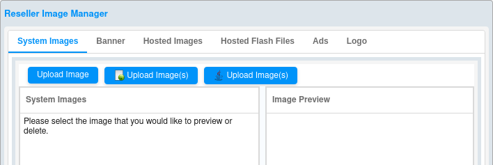
Image Manager Views
Panes
The image directory screens per image type (System Images, Banners, Hosted Images, Hosted Flash Files, and Ads) are divided into two panes:
1) Thumbnails – All images loaded to each directory tab are displayed as thumbnails in the left-hand pane.
2) Image Preview – When a thumbnail image is selected (clicked on), a larger preview of it will display in the right-hand pane. The “Image Name” and “Image Path” are also provided above the image preview.
View Actual Size
Click the “View Actual Size” button in the “Image Preview” pane to display the full-size image as originally loaded.
Image Directories
System Images – Manage your System Images. When initially navigating to eStore Manager -> Customize Store -> Image Manager, the “System Images” tab (directory) displays by default. System Images are currently referenced when utilizing the Logo Widget, and will likely be slated for additional functionality with future development. Upload to this directory if you need to pull a logo image into your eStore content. Allowable image file types are .jpg, .png, and .gif (including animated .gifs and transparent .gifs).
Banner – Manage your Banners. Uploaded banner images will display on the Banner tab, and will be available to post on store via the Static and Dynamic Banner Widgets. Allowable image file types are .jpg, .png, and .gif (including animated .gifs and transparent .gifs).
Hosted Images – Manage your Hosted Images. Pull these images into Widget content such as the Company Information Widget or the Slide Show Widget. Preview specific Hosted Images to view and copy the file path. This URL path can be referenced on any page or section of the eStore that is HTML capable – for example, the Information Pages (About Us, Services, etc.), Category Page Headers and Footers, within Arbitrary HTML Widgets, etc. Allowable image file types are .jpg, .png, and .gif (including animated .gifs and transparent .gifs).
Hosted Flash Files – Manage your Hosted Flash Files. Reference the loaded flash files on your eStore where you want to add flash content. Preview specific flash files to view and copy the file path. This URL path can be referenced on any page or section of the eStore that is HTML capable – for example, the Information Pages (About Us, Services, etc.), Category Page Headers and Footers, within Arbitrary HTML Widgets, etc. Only .swf file format is allowed.
Ads – Manage your Ads. Use these images to display advertisements on your eStore. Ads may be uploaded in their original dimensions, or proportionally converted to 200px or 100px squares. Just select the appropriate radio button prior to loading. If the original image is not a perfect square, white space will be added as necessary so as not to distort the Ad display on your eStore. Pull these images into the Advertising Widget, or into any page or section of the eStore that is HTML capable – for example, the Information Pages (About Us, Services, etc.), Category Page Headers and Footers, within Arbitrary HTML Widgets, etc. Allowable image file types are .jpg, .png, and .gif (including animated .gifs and transparent .gifs).
Upload Image Options
1) Upload Image – The first button available above the left-hand pane of each image directory tab is for uploading a single image. Click on this button to bring up the “File Upload” box. Navigate to the image to be uploaded and select it. The newly selected image will be added to the image directory, and will display as a thumbnail in the left-hand pane.
2) Upload Image(s) – The second button with the icon is for loading multiple images via a Basic HTML file uploader. This upload process should be available by default with most every operating system. Click on this button to bring up the “Upload images” box.
Click the “Browse” button to bring up the “File Upload” box. Navigate to the images to be uploaded and select them. Then, click the “Upload” button. The names of the newly loaded image files will display in a list, followed by an “Upload more files” hyperlink. You may either continue uploading more image files by this same method, or close the “Upload images” box. The newly selected images will be added to the image directory, and will display as a thumbnails in the left-hand pane.
3) Upload Image(s) – The third button with the java icon is for loading multiple images via a Java file uploader. For this upload process to be available, the latest version of Java must be loaded to your computer. Click on this button to bring up the Java “Upload Images” box.
Click on the “Browse” button to pull up the Java “Open” box.
Navigate to the images to be uploaded, select them, and click the “Open” button. The newly selected image names and details will display in a table in the Java “Upload images” box.
From this Java “Upload images” screen, you may opt to:
1) Delete all images selected to be uploaded by clicking the “Remove All” button.
2) Select specific image(s) to delete, and click the “Remove Selected” button.
3) Upload the desired list of images by clicking the “Upload” button.
4) If the image upload is in process and you want to stop it, click the “Stop” button.
When complete, close the Java “Upload images” box. The newly uploaded images will be added to the image directory, and will display as thumbnails in the left-hand pane.
Deleting an Image
To delete an image from any tabbed directory – System Images, Banners, Hosted Images, Hosted Flash Files, or Ads – select the image by clicking on its thumbnail in the left-hand pane, and then click the “Delete” button in the “Image Preview” pane. The deleted image will be removed from the image directory and will no longer display as a thumbnail in the left-hand pane.
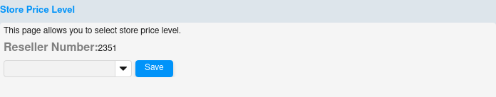
Store Price
Click on the “eStore Manager” button. Select the “Customize Store” tab and then the “Price Level” sub-tab. The Platform Administrator will have determined up to seven Price Levels from which to choose. If alternate Price Levels are available here, select the desired level from the drop-down menu and click “Save.” The selected Price Level will be applied to your entire eStore.
Manage Coupons
Click on the “eStore Manager” button. Select the “Customize Store” tab and then the “Manage Coupons” sub-tab.
Creating a Coupon
To create a new coupon, click the “Add” button. A pop-up box will require the following information:
● Coupon Name: Enter the name of the coupon. This field is alphanumeric with a maximum of 16 characters. Spaces are allowed.
● Code Number: Enter the code that will be associated with the coupon. This field is alphanumeric with a maximum of sixteen characters, no spaces.
● Price Level: Select the Price Level that will be associated with the coupon from those that have been previously determined by the Platform Administrator.
After completing the required fields, click “Save.”
Editing a Coupon
To Edit a coupon, click on the adjacent “edit” hyperlink in the far right column of the “Coupon Manager” table. This will bring up the “Edit Coupon Code” box in which you will be able to modify the Coupon Name and/or Price Level. When you have completed your changes, click “Save.” If you do not wish to save your changes, simply close the pop-up box without saving.
Deleting a Coupon
To Delete a coupon, click to highlight the desired coupon record on the “Coupon Manager” table, and click the “Delete” button. You will see a confirmation pop-up box, and the coupon will be removed from the list.
Manage Salesperson/Clerk
Click on the “eStore Manager” button. Select the “Customize Store” tab and then the “Manage Salesperson/Clerk” sub-tab.
Adding a Salesperson/Clerk
To add a new salesperson, click the “Add” button. A pop-up box will require the following information:
● Salesperson Name: Enter the name of the Salesperson/Clerk.
● Salesperson Code: Enter the code to be associated with the Salesperson. This field is alphanumeric with a maximum of sixteen characters, no spaces.
Editing a Salesperson/Clerk
To Edit a Salesperson, click on the “edit” hyperlink in the far right column of the “Salesperson/Clerk Manager” table. This will bring up the “Edit Salesperson” box in which you will be able to modify the Salesperson Name. When you have completed the changes, click “Save.” If you do not wish to save your changes, simply close the “Edit Salesperson” box.
Deleting a Salesperson/Clerk
To Delete a Salesperson, click to highlight the desired Salesperson record on the Salesperson/Clerk Manager table, and click the “Delete” button. You will see a confirmation pop-up box, and the Salesperson will be removed from the list.
How to Use Coupons and Salesperson/Clerk on Store
The Salesperson should provide each customer with the coupon code that he/she should use on the eStore to reflect the appropriate Price Level assigned to that customer.
The customer should then login to the eStore, and from the Account Manager page, click on the “Coupon Code” link in the Orders’ section.
This will bring up the “Coupon Code” screen for applying the code to the customer account. The Coupon Code has the following format:
[Code Number]-[Reseller Number]-[Salesperson Code]
example: BTS-1000-rd100
Once a Coupon Code is entered on the eStore, it cannot be removed. If the coupon, for example, is a temporary promotion, the Reseller can edit the coupon (see section 6.2.6. Manage Coupons -> Editing a Coupon) to re-set the Price Level to the appropriate level after the promotion expires.
Reseller Price Group
Click on the “eStore Manager” button. Select the “Customize Store” tab and then the “Reseller Price Group” sub-tab. Any available Product Price Groups as well as Price Levels have been previously determined by the Platform Administrator. Select the appropriate Price Level from the drop-down menu for each Product Price Group listed on the table, and click “Save.”
This functionality allows more refined pricing strategies for different product groups as available. For example, a Reseller may select one Price Level for their overall store; however, segment the products in the available Product Price Groups and price them differently, if so desired.
Select Categories
To select categories, click on the “eStore Manager” button and select the “Select Categories” tab. This section provides a view of available product categories and subcategories. It also allows you to hide or display categories on your eStore.
All available categories are listed in the left-hand pane. When highlighted, the select category’s details and settings display in the right-hand pane.
Check the box “Sorted” to sort the list alphabetically for easier reference.
The Category Names initially display the main parent categories only. If the parent categories have subcategory levels under them (child, grandchild levels, etc.), an expansion arrow will display to the left of the parent Category Name. Click the expansion arrow to reveal the next level of subcategories. To collapse any level of category or subcategory, click the adjacent expansion arrow again.
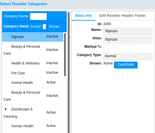
Category Active Status
Only the categories that are “Active” will display on the eStore. To edit the active status of a category or subcategory, click to highlight the specific category or subcategory that you want to activate or deactivate. Then, click on the “Activate” or “Deactivate” button accordingly. If a category is deactivated, all of its subcategories (if any) will automatically be set to inactive, too.
If you wish to change the status of an entire inactive category branch (including parent category and all of its subcategory levels) click “Activate this and below” to activate the highlighted category as well as all of its subcategories.
If, on the other hand, you wish to make only the selected category active without changing the active status of all its subcategories, click the “Activate” button instead.
After making any changes to the active status of product categories, click the “Activate Changes Now” button to rebuild the category tree to reflect these edits on your eStore display.
Edit Information Pages
To access the Information Page editor, click on the “eStore Manager” button and select the “Edit Information Pages” tab. Here you may edit the content of your eStore’s Information Pages, such as “About Us,” “Appointments,” “Services,” etc., as allowed by the Platform Administrator.
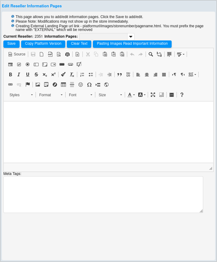
For more advanced formatting options, click the “Source” button to change the edit pane to the HTML source code. The Information Page editor is fully HTML capable. Use the source code window to customize your text, background and layout. Pull in images, flash files, videos, etc.
To view how the entered code will display on store, simply click the “Source” button again. This button will toggle the edit view from the source code back to the normal display mode, and vice versa.
Information Page Types (most commonly used)
NOTE: The Platform Administrator determines which Information Pages are made available to Resellers for edit purposes. The page examples shown below are the ones for which a Reseller is most likely to have override privileges. You may be able to modify more or fewer Information Page types depending on these platform settings.
About Us
The “About Us” page is an introduction from you, the eStore operator, to the customer. Use this page to familiarize your customers with your company's goals and origins while establishing credibility. An About Us section is essential for allowing your customers to distinguish you from your competition.
Treat the About Us section as you would any other business introduction. Cover the basics:
· Who you are.
· What you do.
· Goals of your company or eStore.
Contact Us
A system generated form collects the Name, Email, Phone Number, and Comments from the customer. Only the text displaying above the form fields can be edited via this Information Page. Use the “Contact Us” page to tell your customers the best ways to contact you. The purpose is to encourage your customers to talk to you or inquire more about your products or services. Ultimately, this page helps to generate more potential business for your eStore. The form is automatically submitted to your Customer Service email address as provided at eStore Manager -> Customize Store -> Store Information.
Services
The “Services” page can be used any way you choose, such as to display a price list or to describe the services you offer. Remember that HTML formatting can be utilized to pull in graphics, flash, video, etc. to help the customer form an image of what is offered.
Appointments
A system generated form collects the Name, Requested Date, Requested Time, Email, Phone Number, and Comments from the customer. Only the text above this standard form can be customized. The form is automatically submitted to your Customer Service email address as provided at eStore Manager -> Customize Store -> Store Information.
In the editable section above the form, you may wish to include:
· The hours of operation.
· When the customer can expect a response.
· The purpose or type of appointment that can be requested by submitting the form.
RMA Form
“RMA” stands for Return Merchandise Authorization. A system generated form collects the Name, Email, Phone Number, Order #, and Comments from the customer. Only the text displaying above the form fields can be edited via this Information Page. The customer will be directed here when he/she needs to return a product. The form is automatically submitted to your Customer Service email address as provided at eStore Manager -> Customize Store -> Store Information.
Checkout Page Text
The “Checkout Page Text” is displayed on the first page of the shopping cart. A customer accesses this page on your eStore immediately after clicking on the “Shopping Cart” link (provided the cart is not empty). If desired, you can include notes about the checkout process, or any information that you would like the customer to know while in the checkout process.